Ulises Carrión, Untitled, date unknown. Stamping ink on paper, 13 ½ × 9 5/8 in. (34.3 × 24.5 cm). © and courtesy the Estate of Ulises Carrión
Re: Collection invites a range of historians, curators, and artists to respond to the artworks in our collection through approachable texts.
Ramon Tejada, 2022–23 Graphic Designer in Residence, muses on the multiplicity of perspectives on Latin American graphic design represented within the Institute for Studies on Latin American Art (ISLAA) Library and Archives, drawing upon printed matter and ephemera produced by artists and organizations, including Centro de Arte y Comunicación (CAYC), Galería Lirolay, and Ulises Carrión.
As a graphic designer, digging 1 through the ISLAA Library and Archives 2 was inspiring yet overwhelming, due to the sheer wealth of printed matter, graphic design works, and what I refer to as “artes graficás.” 3 What emerged was a picture of the beauty, breadth, and complexity of the Latin American art and design communities. As I reflected on my findings, a loose array of ideas, questions, and observations about works of graphic design began to take shape. These thoughts (words, sentences, strands of ideas, histories) have prompted me to reflect on what I thought I was going to find and what I actually found. The graphic designer in me was intentionally looking for works that spoke about community, colonization, revolution, and politics in the continent. I ultimately found that and much more.
As I anticipated, I encountered a good deal of modernist-influenced graphic art in the archives. What I did not anticipate was the breadth of work that I would find, its many sources—cooperatives, communities, artists, designers, craftspeople—and the panorama of themes and narratives it addressed in relation to the daily lives of the peoples of Latin America. Each archival box presented a plurality of perspectives, beautiful possibilities, and gifts.
My archival adventure emphatically confirmed that graphic work from Latin America defies distillation into a single essence. The landscape of the Latin American context is vast, rich, and varied, spinning beautifully toward pluriversal 4 ways of being.

Cover of the publication Kokah de Lujo, by Eduardo Gudiño Kieffer and Edgardo Giménez (Buenos Aires: Editorial Barlovento, 1976). © the artist. Courtesy Edgardo Giménez and MCMC Galería
LAS NOTAS/NOTES
1. It is impossible to talk about Latin America (and its artistic and design production) without considering its history and the confluence of factors that played a vital role in the continent’s artistic development:
Colonialism → Politics → Power grabs → Religious interventions → Revolutions → Social and political uprisings → Migration and immigration → The disappearance, erasure and marginalization of the Indigenous and local histories → The conflict between la gente/el pueblo(the people) and the bourgeoisie
These are all key motivators and influences that are present in the efforts of many artists and designers whose works originate in the complex societies of Latin America.
2. The influence of European ideas, either through colonization or, later, through migration, has left an undeniable and indelible imprint on the work of artists and designers from Latin America.
Invitation for A Journal of Objects for the Chilean Resistance, an exhibition of work by Cecilia Vicuña at Arts Meeting Place, London, July 21–28, 1974. © and courtesy the artist
GRAPHIC DESIGN
3. Historically, the field of graphic design 5 has focused on and elevated the work and thinking of the Global North. Like much of art and design, the fields of graphic design and typography emerge from the European Renaissance and modernist movements in Europe (such as the Bauhaus and its progeny). These ideals and ways of seeing and making have been codified as accepted or “universal” norms.
4. Graphic design should be referred to as Western European graphic design.
5. Graphic design in the contemporary Latin American context has been deployed for commerce and capitalistic endeavors—“Buen diseño para la industria” (good design for industry)—such as branding for multinational corporations and state-owned entities). 6

Invitation for the exhibition Bertha Rappaport at the Galería del Centro Argentino por la Libertad de la Cultura, May 1965. Design by Edgardo Giménez. Courtesy Edgardo Giménez and MCMC Galería
ARTES GRÁFICAS
6. Local culture, el pueblo, and la gente are expressed through artes gráficas (graphic arts).
7. Artes gráficas move through communities; they are more inclusive, pluralistic, and localized; and they maintain a fluid way of being that mirrors the continent’s cultures, histories, and geographical landscapes. They consider the interdisciplinary movement of artists and communities through artistic mediums, ways of making, gestures, ideas, and perspectives.
8. In a local context, artes gráficas are deployed to create works that speak to the community in languages specific to those being addressed: Diseño que ayuda a facilitar la creación de una comunidad social y política, llena de ideas y felicidad, manifested through espacios públicos, acciones, acciones gráficas, y lo colectivo. In this approach, local production methods are used in collaboration with community members to make work that speaks directly to the community. The artists and designers who create artes gráficas experiment with the “standards” of graphic design in localized ways, using what has been left behind by colonialism writ large. 7
9. Latin American artists and designers deploy artes gráficas to gather, join, develop, and support communities. In these communities, conversations and ideas about cultures and politics emerge from a multitude of perspectives.
10. These communities are making “designs [and art] that foster convivial reconstruction beyond the cultures of expertise and that promote a pluriverse of partially connected worlds in which all worlds strive for justice and craft autonomous relational ways of being while respecting the ability of other worlds to do the same.” 8
Invitation for the exhibition on Marcia Schvartz: Esto También es Uropa at Artemúltiple, Buenos Aires, June 2–27, 1981. © and courtesy the artist
TYPOGRAPHY
11. When we speak of typography in the context of design, we are generally referring to a tradition that is primarily defined by the Latin alphabet.
12. In the words of designer and curator Ellen Lupton, “Typography is what language looks like.” For the purposes of this text, we are speaking primarily of giving the Spanish and Portuguese languages—holdovers of colonialism in the continent—a visual form. This linguistic homogeneity is in stark contrast to the lingual wealth that preceded colonization. Some studies estimate that more than two thousand languages were spoken throughout the Americas. 9 Despite the devastation caused by the European conquest, there are currently more than four hundred languages spoken in Latin America—some quite widely, such as Quechua and Guaraní, which are respectively used by ten million and six-and-a-half million people today.
13. Since the invention of the letterpress in 1455, printed matter—such as announcements, newspapers, and flyers—has become an important and accessible mode of communicating and sharing ideas. 10
14. The first traditional printing press in the Americas appeared in Mexico City around 1539. 11 The history of printed matter and its use in disseminating ideas (artistic, social, and political) has deep roots in Latin America. An example is the work of the “Taller de Gráfica Popular,” founded in Mexico City in 1937. 12 The collective’s printed matter dealt with various subjects, including history and political and social themes.
15. Digging through the ISLAA Library and Archives, one encounters various iterations of modernism. The works in the reading room present extensive incorporation of the codified gestures of Western European graphic design and typography: the exacting use of grids and typographic conventions of the European Modernists (see the press announcements and catalogues from the Centro de Arte y Comunicación [CAYC]); a sharp focus on order, hierarchy, clarity, and reduction (especially apparent in the work created in the second half of the twentieth century); and the abandonment of maximalist and ornamental gestures in favor of functional, reductive ones.
16. Of particular prevalence in this period is the use of sans serif typefaces, particularly the Swiss Helvetica, 13 which were readily accessible to printers and used extensively in work created for corporations, business, and industry. Helvetica and the associated design approach and philosophy became the “good” way to communicate visually worldwide: the universal style. This approach was believed to provide the work with authority and legitimacy. The visual language of forms created in Europe thus became cemented as the norm.
17. These forms (graphic gestures such as Helvetica, which were associated with hierarchy and order) carry centuries of baggage. They are part of colonization’s legacy of brutalization of the land, the Indigenous peoples, and their ideas, customs, and language. These typographic artifacts have become a manifestation of centuries of atrocities and erasure.
18. Modernist typographic forms (Helvetica) and structures (grids and other comparable compositional approaches to “organizational clarity”) gave this printed matter authority and legitimacy while often bypassing established local vernaculars. 14
19. Designer, researcher, and editor Silvia Fernández writes, “This modernity—or, better, ‘proto-modernity’—brought the period of ‘good taste and good speaking’ adopted from the Spanish colonizers to an end. Nevertheless, it was connected to Europe: travelers, immigrants, and exiles carried in their luggage testimonies of modernity in the form of books, magazines, works of art, and above all, ideas, which—along with the local ‘Criolla’ [lo cotidiano] culture—formed the new imaginary.” 15
20. Of the printed matter that I encountered in the ISLAA Library and Archives, I gravitated particularly toward invitations and records of gatherings and meetings. These objects are examples of design and artes gráficas in the service of and as a conduit for community—they create spaces for engagement, gathering, and discussion. These “communities” included galleries and pop-ups that functioned outside of institutional spaces.
21. Printed matter and typography are conduits for building local communities.
22. Printed matter and Mail art are forms of decentered, communally created art and design. The networked and multireferential nature of these forms co-opt systems of power and put them to novel and anti-institutional use. Regarding Mail art’s relationship with state institutions such as the postal service, Mexican artist and publisher Ulises Carrión said that the art movement “knocks at the doors of the castle where the Big Monster lives.” 16
SOME ADDITIONAL WORKS FROM THE ARCHIVES
Founded in Buenos Aires in 1968, CAYC was a multidisciplinary space that created a platform for the development of new and experimental art. The group’s visual identity aligned with the prevailing gestures of European modernist graphic design at the time, employing Helvetica in their logo and systematizing their printed matter (including invitations, press releases, and catalogues) through the use of a grid. It is not without irony that this controlled, hierarchical visual language was used to present the work of artists who critiqued colonial power in Latin America. 17
Hector Puppo,Trampera, 1976. Mimeograph, 10 5/8 × 8 ½ in. (27 × 21.6 cm). © and courtesy the artist and Matías Glusberg
Cover of the exhibition catalogue Hacia un perfil del arte latinoamericano, edited by Jorge Glusberg (Buenos Aires: Centro de Arte y Comunicación, 1972). Glusberg also organized the exhibition of the same title for the Encuentro Internacional de Arte en Pamplona, España; Pamplona, Spain, June 26–July 3, 1972. © and courtesy Matías Glusberg
Spreads from the exhibition catalogue Hacia un perfil del arte latinoamericano. © and courtesy Matías Glusberg
Spreads from the exhibition catalogue Hacia un perfil del arte latinoamericano. © and courtesy Matías Glusberg
Spreads from the exhibition catalogue Hacia un perfil del arte latinoamericano, edited by Jorge Glusberg (Buenos Aires: Centro de Arte y Comunicación, 1972), showing artwork by Auro Lecci along with an artist statement, portrait, and biographical information on the artist. Glusberg also organized the exhibition of the same title for the Encuentro Internacional de Arte en Pamplona, España; Pamplona, Spain, June 26–July 3, 1972. © and courtesy the artist and Matías Glusberg
Spreads from the exhibition catalogue Hacia un perfil del arte latinoamericano, showing artwork by Auro Maxera along with an artist statement, portrait, and biographical information on the artist. © and courtesy the artist and Matías Glusberg
Galeria Lirolay (1960–81) is credited with giving a home to the countercultural Argentine artistic movements of the 1960s. Several of the graphic works that the gallery produced were created by the designer Edgardo Giménez,“ 18 then considered an enfant terrible, at times in collaboration with thedesigner Ricardo Blanco. These invitations to group shows and gatherings veer from templated formulae toward more expressive, colorful, and daring typography. For example, the invitation for an exhibition of textiles by the artist Nora Agrest uses the typeface Cooper Black, departing from the prevailing use of sans serif gothic typefaces in this kind of printed piece. The invitation’s design is pushed further by the inclusion of hand drawings, creating a surface on which Agrest’s local language meets more rigid modernist design gestures.
Press release for the exhibition Taller del encuentro de Frida Nemirovsky at Galería Lirolay, Buenos Aires, December 4–16, 1972
Invitation for Graciela Zar: Dibujos y Grabados at Galería Lirolay, Buenos Aires, April 14–19, 1969. © the artist
Invitation for the exhibition Guillermo Ripodas: Pinturas 1969 at Galería Lirolay, Buenos Aires, April 14–19, 1969. © the artist
Invitation for the exhibition Nora Agrest: Tapices at Galería Lirolay, Buenos Aires, April 9–21, year unknown. © the artist
Ulises Carrión is often considered one of the key figures of Mexican Conceptual art. He was born in San Andrés Tuxtla, Mexico, in 1972, and, after finishing his studies, he moved his practice to Amsterdam, where he opened the highly influential Other Books and So, a distribution center for artists’ publications and multiples. He is one of the key figures and proponents of Mail art. Carrión’s highly fluid production style (which spans typography, handwriting, typewriting, stamps, and ephemera) removes itself from the neatly organized and minimalist conceptual works of many art and design “heroes.” It is idiosyncratic, maximalist, exuberant, and humane in its ways of engaging, talking, and opening to fluidity.
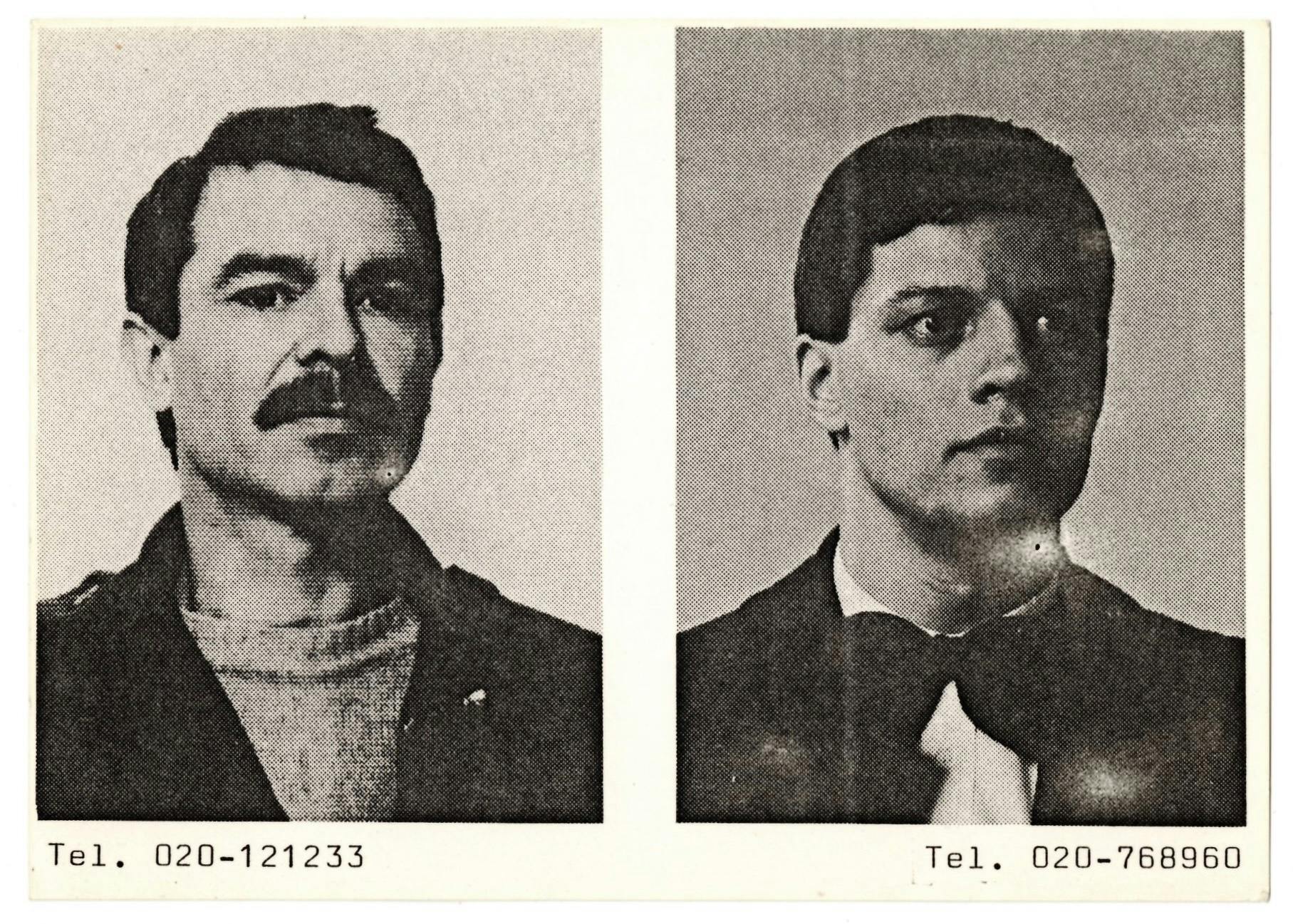
Ulises Carrión, Multiple Choice, 1981. Offset print on card stock, 4 3/16 × 6 1/16 in. (10.6 × 15.4 cm). Photos of Carrión by H. Hoffmann and Marike Stooker. © and courtesy the Estate of Ulises Carrión
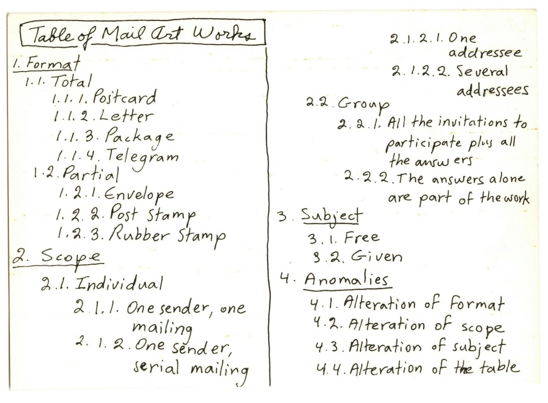
Ulises Carrión, Table of Mail Art Works, ca. 1980. Offset print on card stock, 4 3/16 × 5 13/16 in. (10.6 × 14.7 cm). Other Books and So Archive, Amsterdam. © and courtesy the Estate of Ulises Carrión
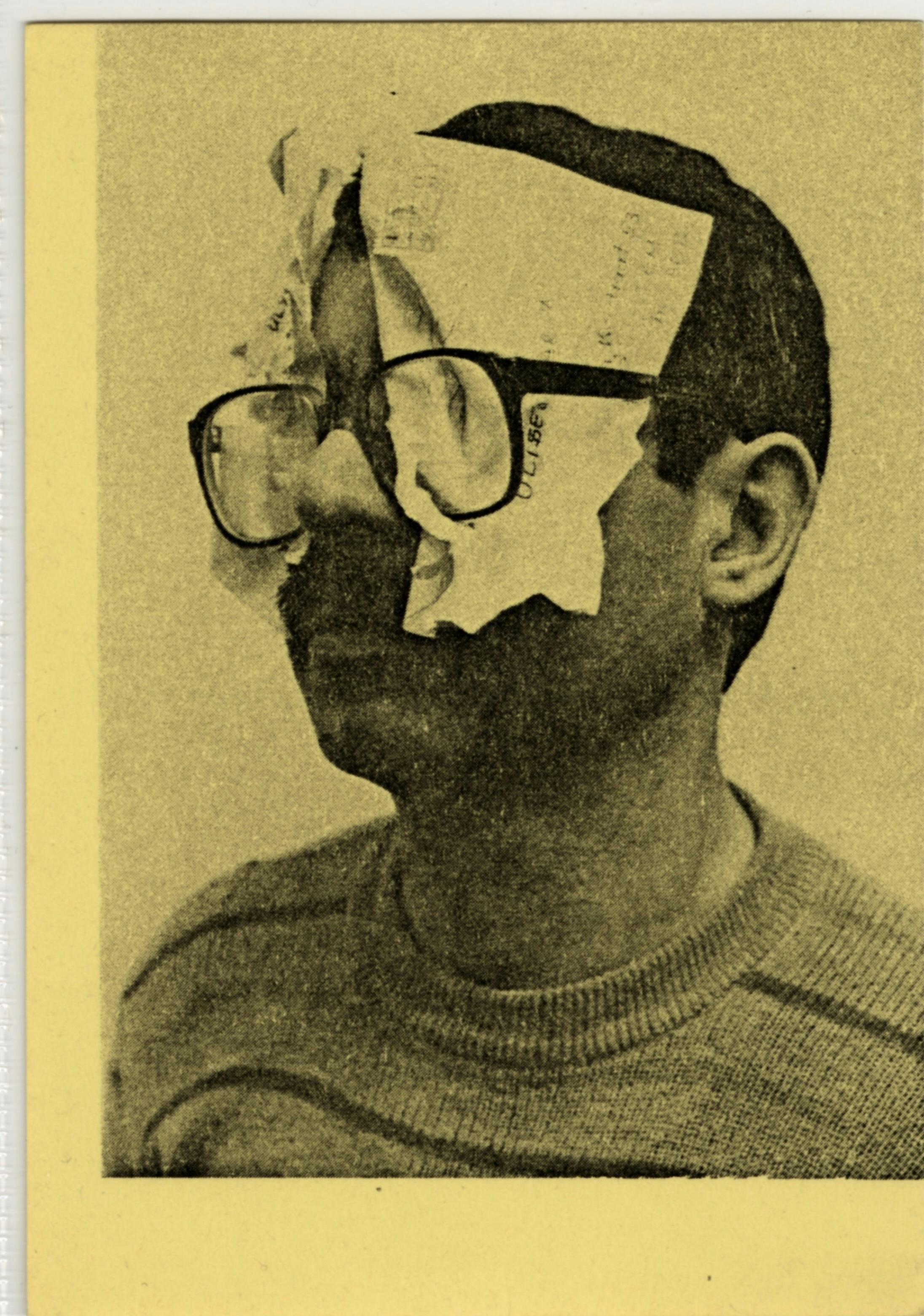
Ulises Carrión, Seeing Mail, 1981. Offset print on card stock, 5 1/8 × 3 5/8 in. (13 × 9.2 cm). Photo of Carrión by J. Liggins. © and courtesy the Estate of Ulises Carrión
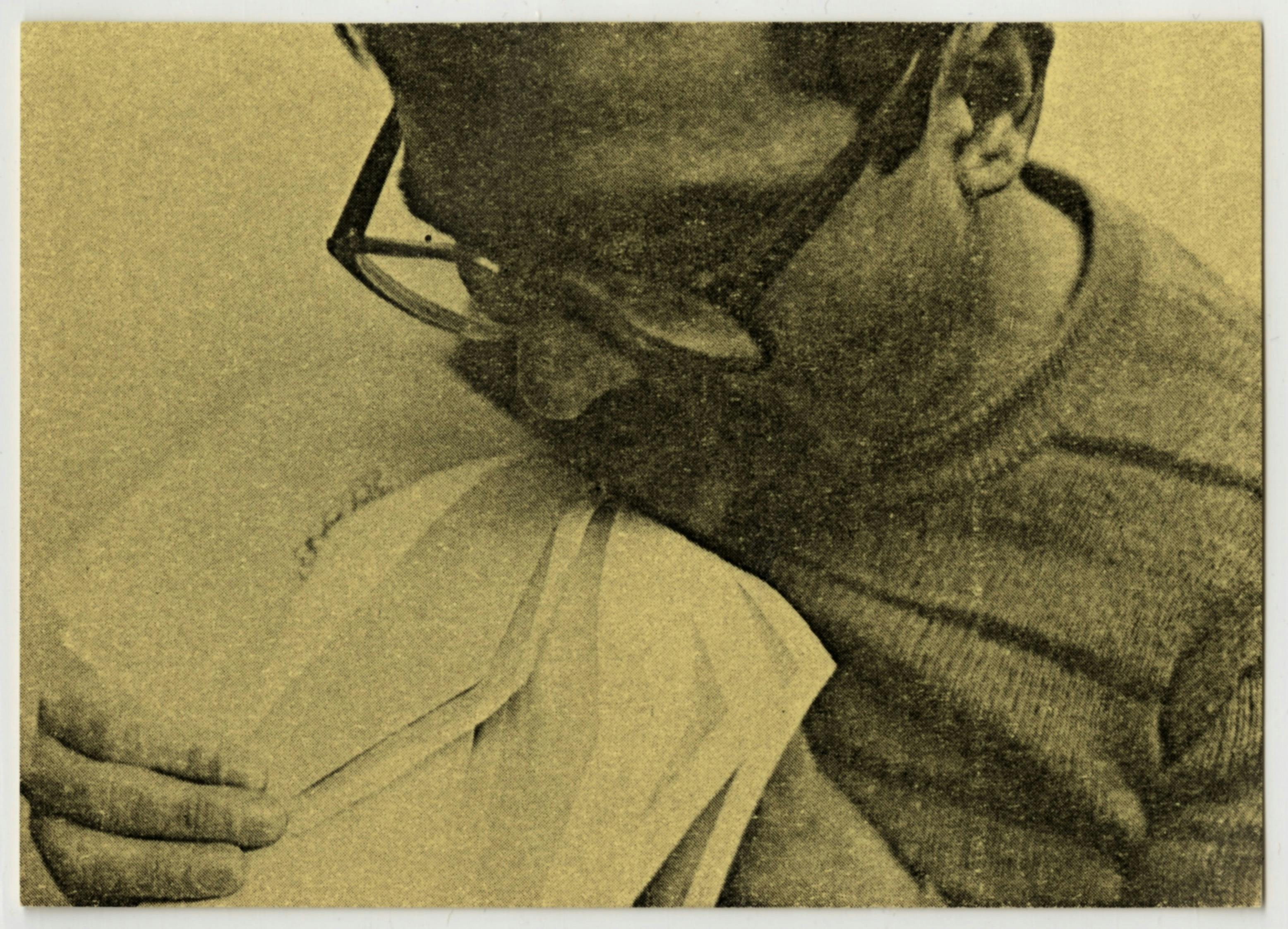
Ulises Carrión, Tasting Mail, 1981. Offset print on card stock, 3 5/8 × 5 in. (9.2 × 12.7 cm). Photo of Carrión by J. Liggins. © and courtesy the Estate of Ulises Carrión
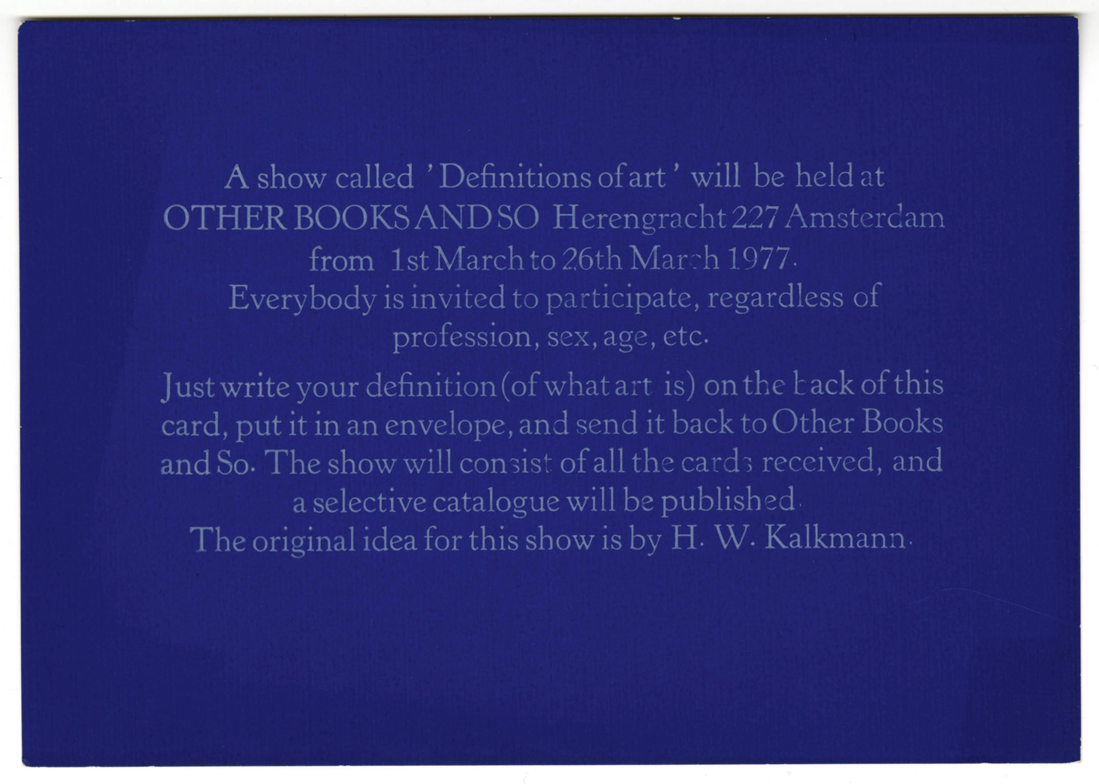
Ulises Carrión, Definitions of Art, 1977. Offset print on card stock, 4 1/8 × 5 15/16 in. (10.5 × 150 cm). The words “ART IS:,” are stamped on the verso. © and courtesy the Estate of Ulises Carrión
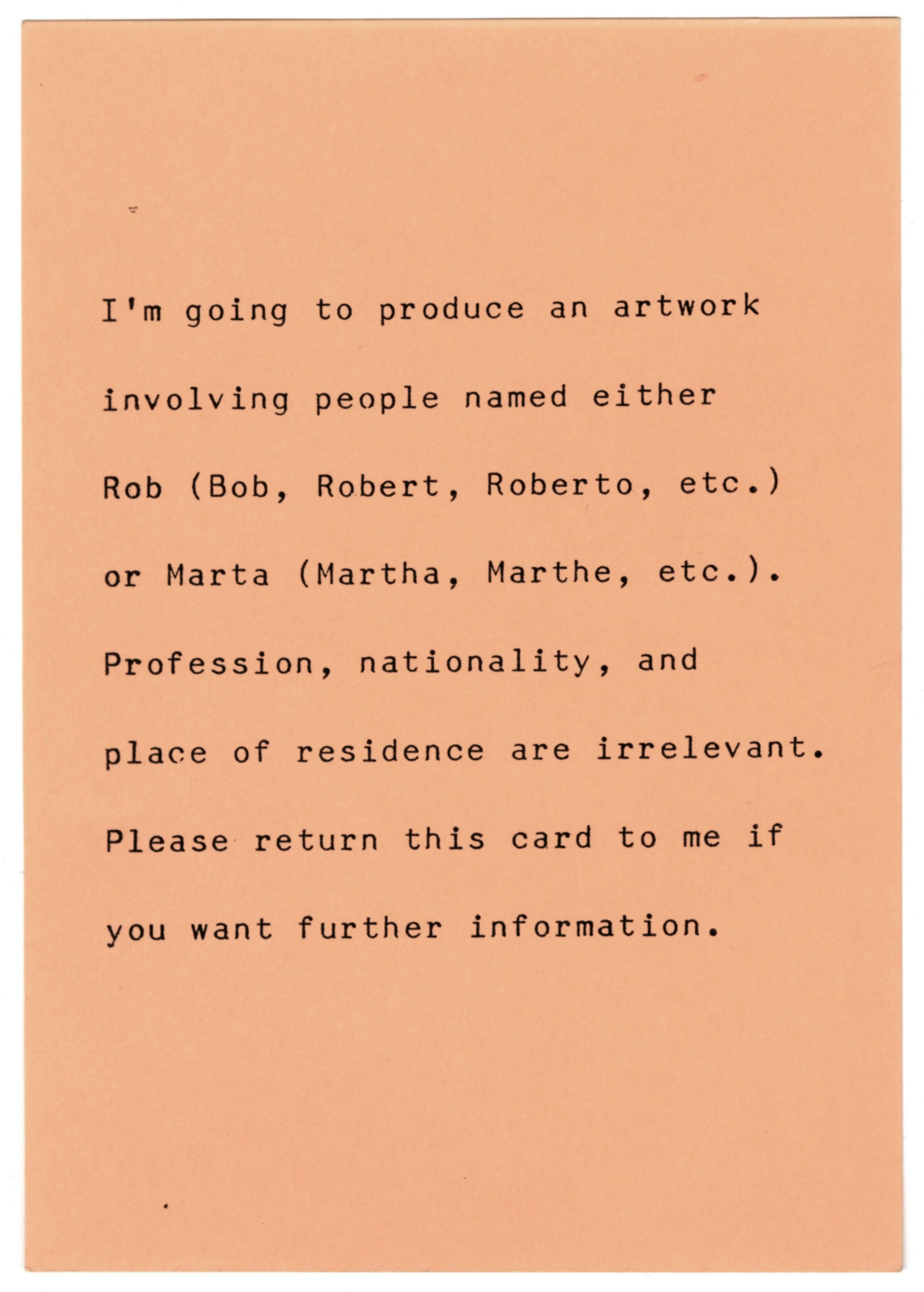
Ulises Carrión, Rob and Marta, 1983. Offset print on card stock, 5 7/8 × 4 3/16 in. (14.9 × 10.6 cm). © and courtesy the Estate of Ulises Carrión
It has not been possible to locate the copyright holders of the ephemera from Artemúltiple and Galería Lirolay, despite having carried out a diligent search. ISLAA makes itself available to rights holders to agree on the content of the legal notice.